##!pip install plotnine ## plotnine이 구축되지 않은 경우 설치해야 한다.Plotnine : R에서 비롯한 패키지
plotnine
plotnine: R에서의 문법을 이용하여 그래프를 그려보자!
1. 라이브러리 import
import numpy as np
import pandas as pd
import matplotlib.pyplot as plt
from plotnine import *
import plotnineplotnine.options.dpi= 150
plotnine.options.figure_size = (6, 5)간단한 그래프 설정이다.
2. mpg data
A. read data
df = pd.read_csv('https://raw.githubusercontent.com/guebin/DV2022/master/posts/mpg.csv')
df| manufacturer | model | displ | year | cyl | trans | drv | cty | hwy | fl | class | |
|---|---|---|---|---|---|---|---|---|---|---|---|
| 0 | audi | a4 | 1.8 | 1999 | 4 | auto(l5) | f | 18 | 29 | p | compact |
| 1 | audi | a4 | 1.8 | 1999 | 4 | manual(m5) | f | 21 | 29 | p | compact |
| 2 | audi | a4 | 2.0 | 2008 | 4 | manual(m6) | f | 20 | 31 | p | compact |
| 3 | audi | a4 | 2.0 | 2008 | 4 | auto(av) | f | 21 | 30 | p | compact |
| 4 | audi | a4 | 2.8 | 1999 | 6 | auto(l5) | f | 16 | 26 | p | compact |
| ... | ... | ... | ... | ... | ... | ... | ... | ... | ... | ... | ... |
| 229 | volkswagen | passat | 2.0 | 2008 | 4 | auto(s6) | f | 19 | 28 | p | midsize |
| 230 | volkswagen | passat | 2.0 | 2008 | 4 | manual(m6) | f | 21 | 29 | p | midsize |
| 231 | volkswagen | passat | 2.8 | 1999 | 6 | auto(l5) | f | 16 | 26 | p | midsize |
| 232 | volkswagen | passat | 2.8 | 1999 | 6 | manual(m5) | f | 18 | 26 | p | midsize |
| 233 | volkswagen | passat | 3.6 | 2008 | 6 | auto(s6) | f | 17 | 26 | p | midsize |
234 rows × 11 columns
### B. descriptions
df.columnsIndex(['manufacturer', 'model', 'displ', 'year', 'cyl', 'trans', 'drv', 'cty',
'hwy', 'fl', 'class'],
dtype='object')- 각 행들이 어떤 의미를 가지는 지 Chat GPT에게 분석을 요청해봤다.
- 그렇단다.
3. mpg의 시각화 : 2차원
A. x=displ, y=hwy
- 예시 1 : 정직하게 메뉴얼대로…
- 파라미터를 직접 지정해주는 경우
ggplot(data = df) + geom_point(mapping = aes(x = 'displ', y = 'hwy')) ## aes : dictionary와 유사하다고 생각하면 된다.
- 파라미터 생략
ggplot(df) + geom_point(aes(x = 'displ', y = 'hwy'))
### B. rpy2 : 코랩 아닌 경우 실습 금지
- R에서도 거의 똑같은 문법으로 그릴 수 있음
#import rpy2
#%load_ext rpy2.ipython
#%%R
#library(tidyverse)
#df = mpg
#ggplot(df)+geom_point(aes(x=displ,y=hwy))4. mpg의 시각화 : 3차원
A. x=displ, y=hwy, shape=class
set(df['class'])  ## 중복되지 않은 값이 어느 것이 있는 지 산출
## df['class'].unique() : 이건 array로 산출된다. 동일한 코드
{'2seater', 'compact', 'midsize', 'minivan', 'pickup', 'subcompact', 'suv'}ggplot(df) + geom_point(aes(x = 'displ', y = 'hwy', shape = 'class')) ## class를 shape로 구분 > 불편함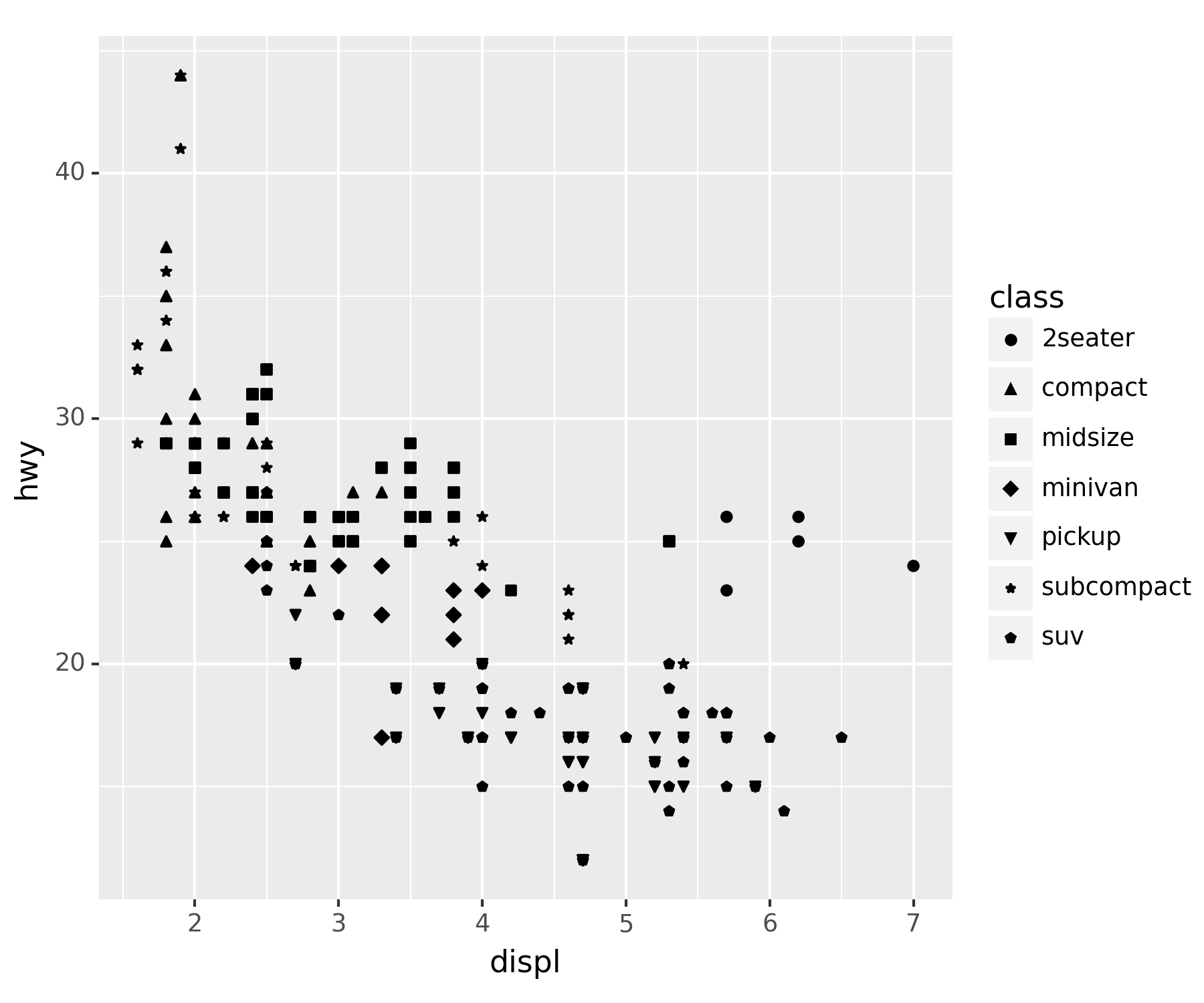
### B. x=displ, y=hwy, color=class
ggplot(df) + geom_point(aes(x = 'displ', y = 'hwy', color = 'class'))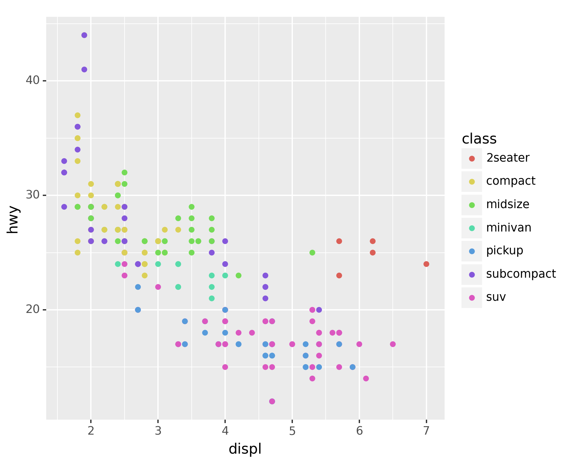
- 모양까지 class별로 달랐으면 좋겠다.
ggplot(df) + geom_point(aes(x = 'displ', y = 'hwy', color = 'class', shape = 'class'))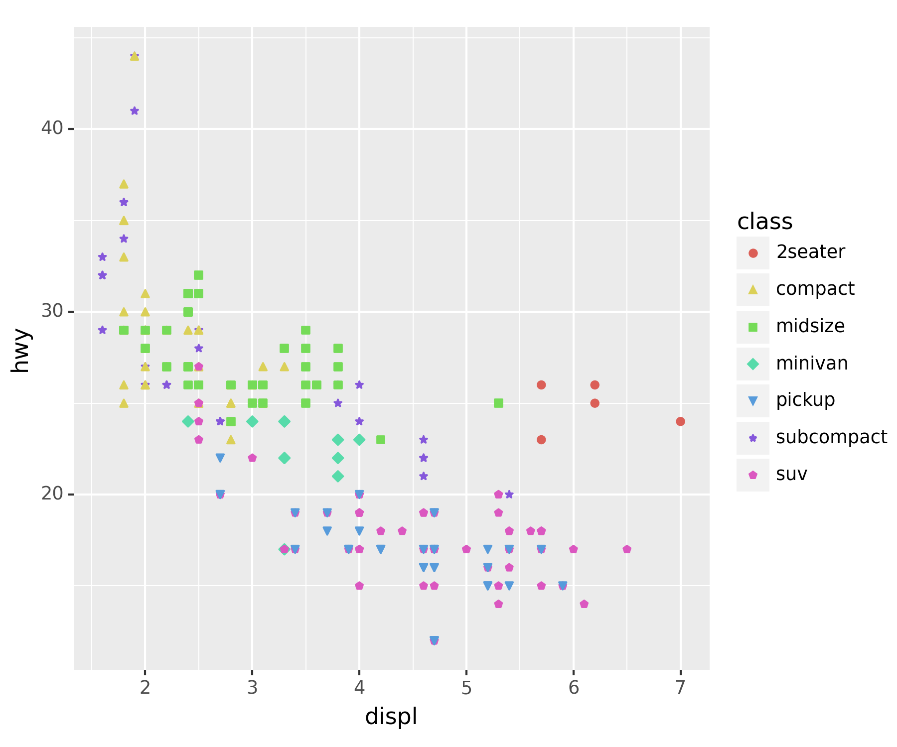
- 전체적으로 포인트의 사이즈를 키우고 싶다.
ggplot(df) + geom_point(aes(x = 'displ', y = 'hwy', color = 'class', shape = 'class'), size = 5) ## 외부 파라미터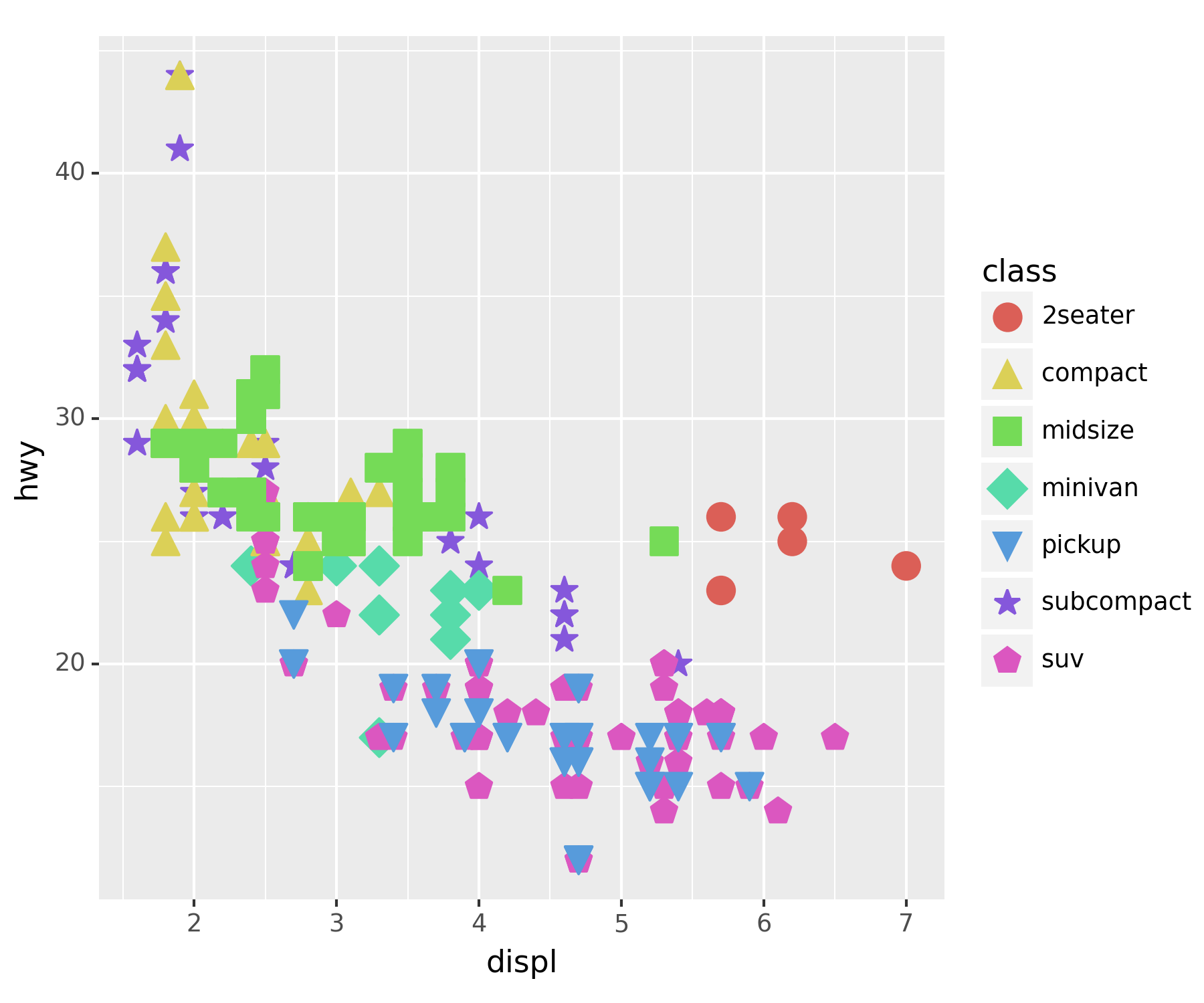
- 너무 커서 겹치니까 투명도 조정
ggplot(df) + geom_point(aes(x = 'displ', y = 'hwy', color = 'class', shape = 'class'), size = 5, alpha = 0.5)
geom_point()에서 내부 aes()에 넣은 값들은 값들을 구분하도록 되며, 외부에 입력된 값은 전체 개체들을 바꿔버린다.
5. mpg의 시각화 : 4차원, 5차원
set(df['drv']) ## 4륜구동, 전륜구동(front), 후륜구동(r){'4', 'f', 'r'}A. drive metiod에 더 중점
ggplot(df) + geom_point(aes(x = 'displ', y = 'hwy', color = 'drv', shape = 'class'), size = 4, alpha = 0.5)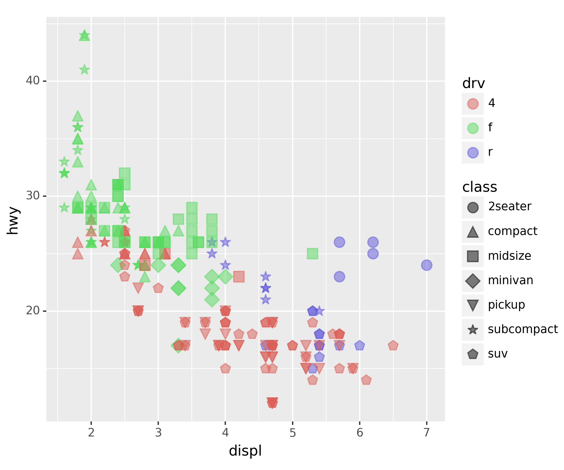
4륜구동이 연비가 낮은 걸 확인할 수 있다.
### B. 5차원 시각화
set(df['cyl']) ## 실린더 수, 4,5,6,8{4, 5, 6, 8}ggplot(df) + geom_point(aes(x='displ',y='hwy',color='drv',shape='class', size = 'cyl'), alpha = 0.5) ## 외부 파라미터에 size는 제거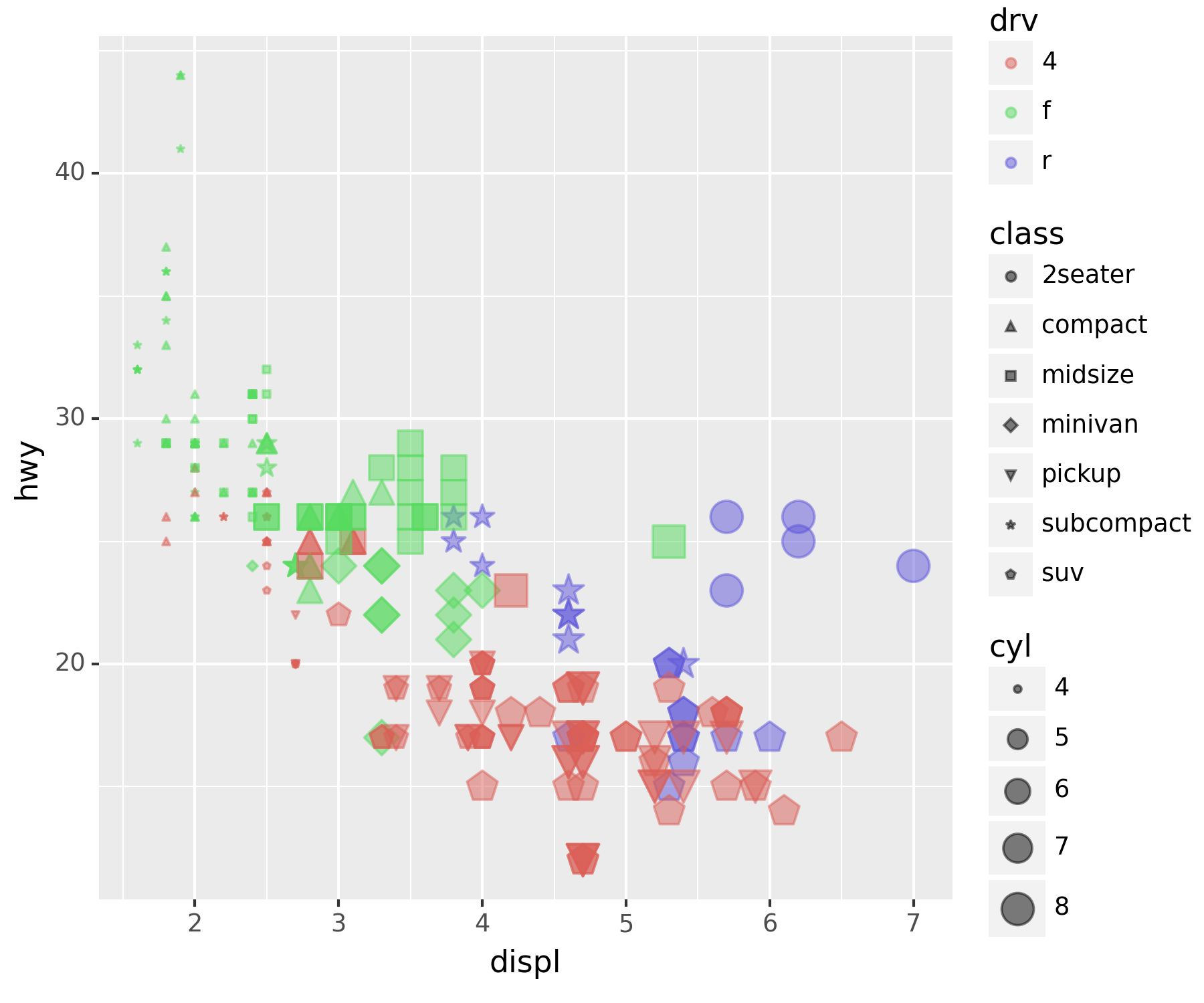
여기까지가 기본적인 사용 방법이다.
6. 객체지향적 시각화
- ggplot의 정체는 뭐지?
type(ggplot)typeclass. 어떤 물체를 만들어내는 함수와 비슷. matplotlib에서의
plt.figure()와 유사하다고 보면 된다.
- 그럼 geom_point는 정체가 뭐지?
type(geom_point) ## class, 생성함수.plotnine.utils.Registrygeom은 그림, 그래프라고 보면 된다. ’fig.add_axes()
후 추가된ax`에 그래프를 그리는 것과 유사
### A. fig + geom_point + geom_smooth
fig  = ggplot(df)
point = geom_point(aes(x = 'displ', y = 'hwy'))
point ## 아무것도 나오지 않음<plotnine.geoms.geom_point.geom_point at 0x121c8015390>fig + point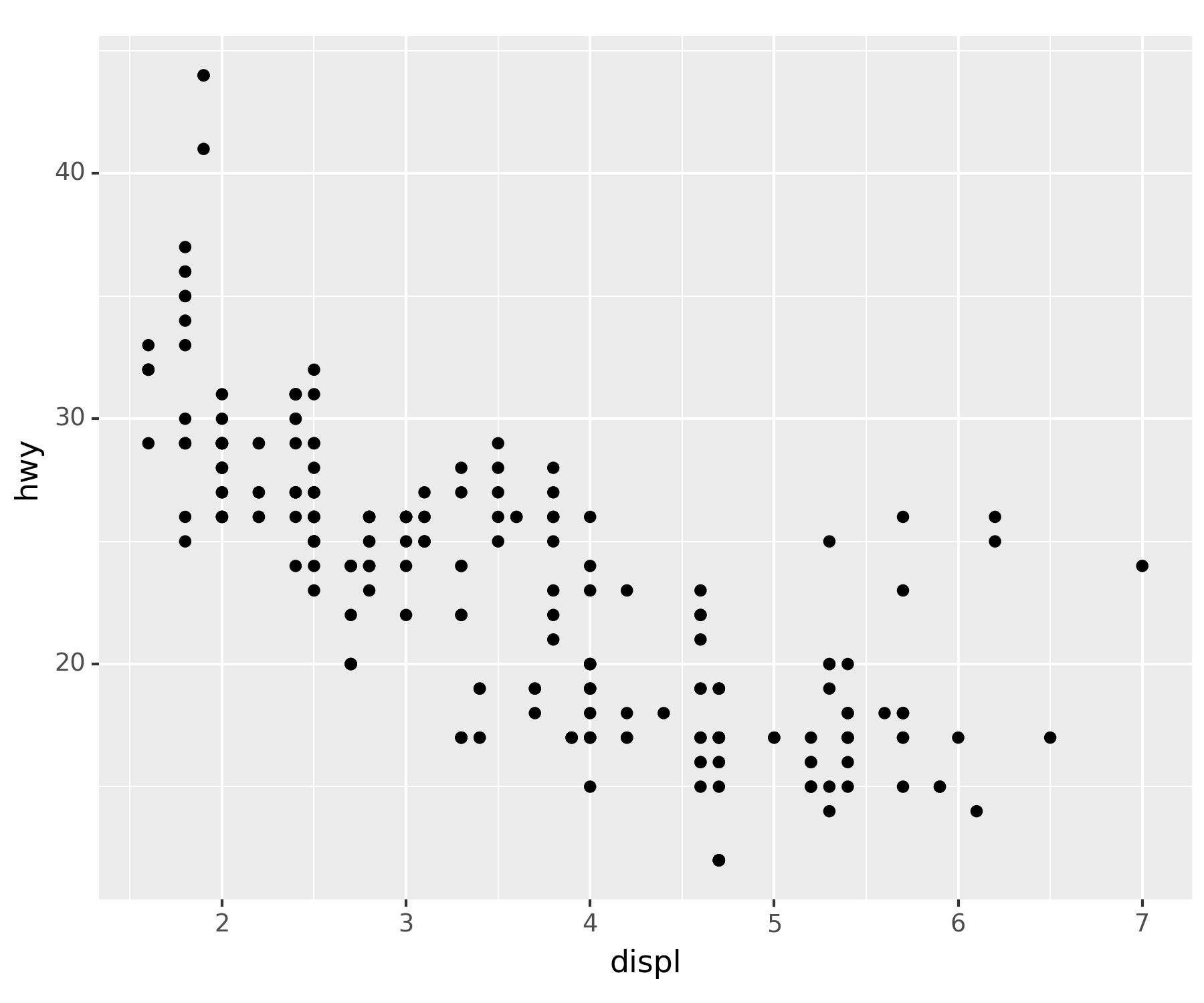
두 개체를 합치니 피규어에 그래프가 들어가버린 형태가 되었다.
geom_smooth()| 산점도가 아닌 직선 그래프를 그려준다.
smooth = geom_smooth(aes(x = 'displ', y = 'hwy'))fig + smooth ## ggplot(df) + geom_smooth(aes(x = 'displ', y = 'hwy')), 추세선 산출C:\Users\hollyriver\anaconda3\envs\py\lib\site-packages\plotnine\stats\smoothers.py:330: PlotnineWarning: Confidence intervals are not yet implemented for lowess smoothings.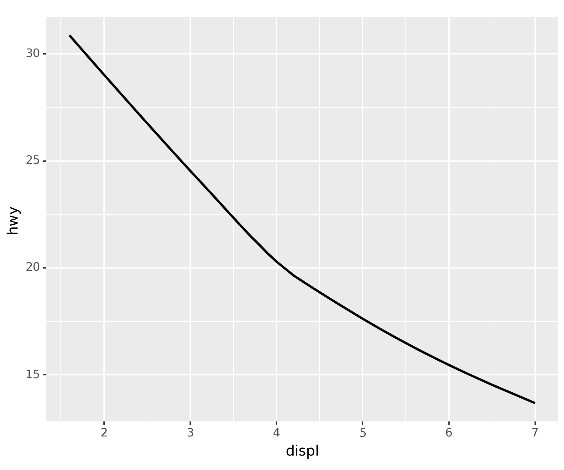
- 그럼 셋을 합쳐보면…
fig + point + smoothC:\Users\hollyriver\anaconda3\envs\py\lib\site-packages\plotnine\stats\smoothers.py:330: PlotnineWarning: Confidence intervals are not yet implemented for lowess smoothings.
ggplot(df) + geom_point(aes(x = 'displ', y = 'hwy')) + geom_smooth(aes(x = 'displ', y = 'hwy'))과 동일하다.
### B. 시각화 개선
geom_point()를 개선
point_better = geom_point(aes(x='displ',y='hwy',color='drv',size='cyl'),alpha=0.5) ## 색상과 크기로 구분fig + point_better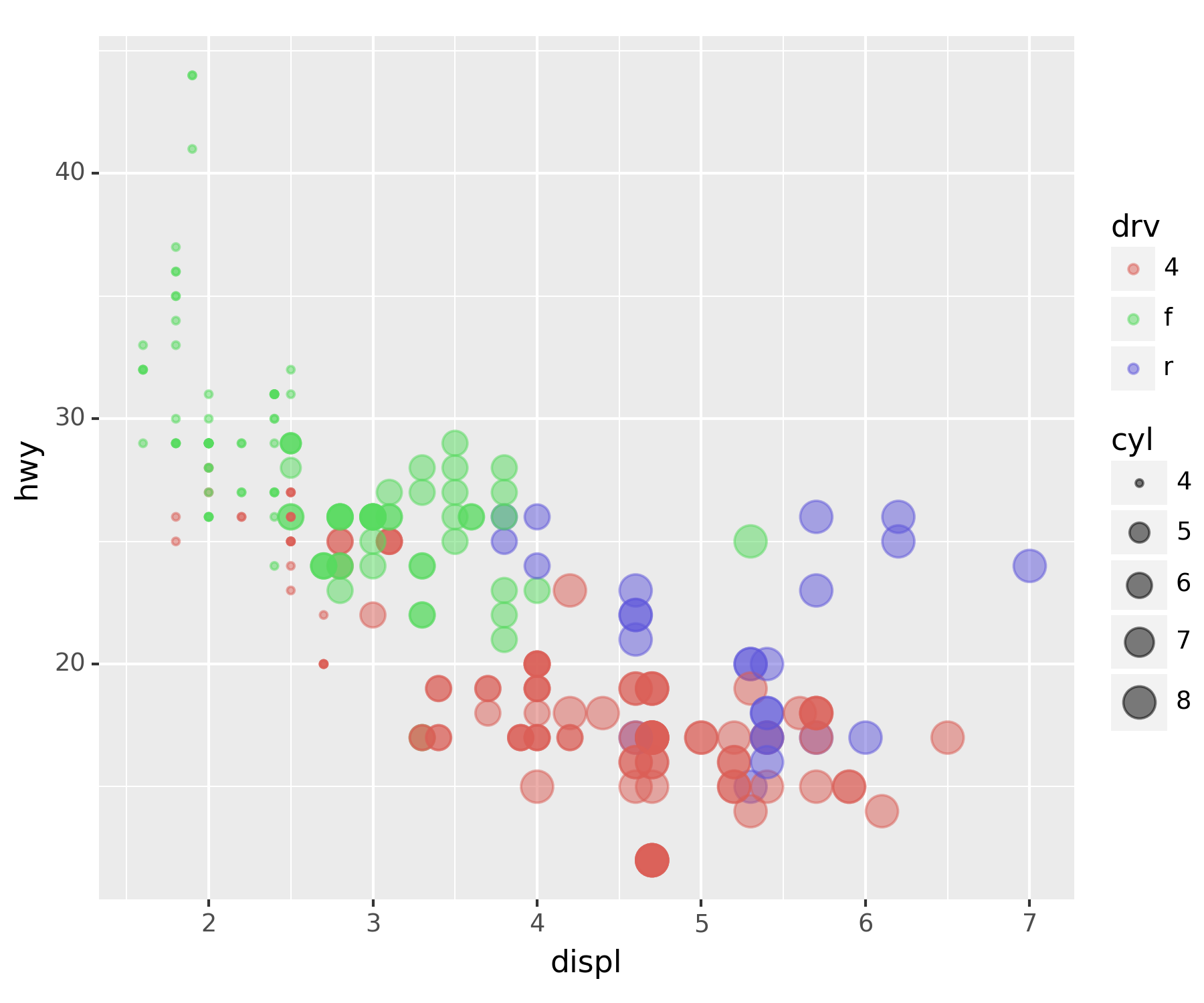
geom_smooth()개선
smooth_better = geom_smooth(aes(x = 'displ', y = 'hwy', color = 'drv'), linetype = 'dashed') ## 차종별로 추세선fig + smooth_betterC:\Users\hollyriver\anaconda3\envs\py\lib\site-packages\plotnine\stats\smoothers.py:330: PlotnineWarning: Confidence intervals are not yet implemented for lowess smoothings.
C:\Users\hollyriver\anaconda3\envs\py\lib\site-packages\plotnine\stats\smoothers.py:330: PlotnineWarning: Confidence intervals are not yet implemented for lowess smoothings.
C:\Users\hollyriver\anaconda3\envs\py\lib\site-packages\plotnine\stats\smoothers.py:330: PlotnineWarning: Confidence intervals are not yet implemented for lowess smoothings.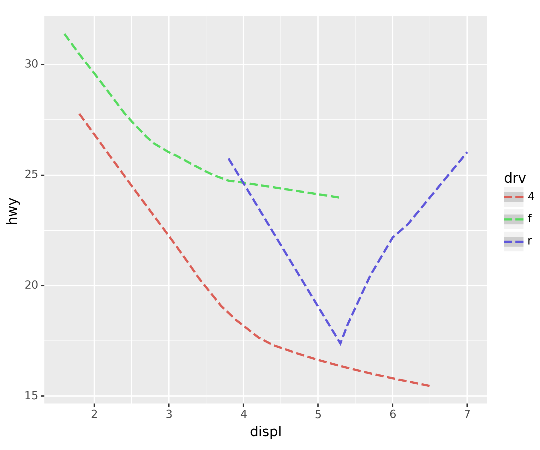
- assemble
fig + smooth_better + smoothC:\Users\hollyriver\anaconda3\envs\py\lib\site-packages\plotnine\stats\smoothers.py:330: PlotnineWarning: Confidence intervals are not yet implemented for lowess smoothings.
C:\Users\hollyriver\anaconda3\envs\py\lib\site-packages\plotnine\stats\smoothers.py:330: PlotnineWarning: Confidence intervals are not yet implemented for lowess smoothings.
C:\Users\hollyriver\anaconda3\envs\py\lib\site-packages\plotnine\stats\smoothers.py:330: PlotnineWarning: Confidence intervals are not yet implemented for lowess smoothings.
C:\Users\hollyriver\anaconda3\envs\py\lib\site-packages\plotnine\stats\smoothers.py:330: PlotnineWarning: Confidence intervals are not yet implemented for lowess smoothings.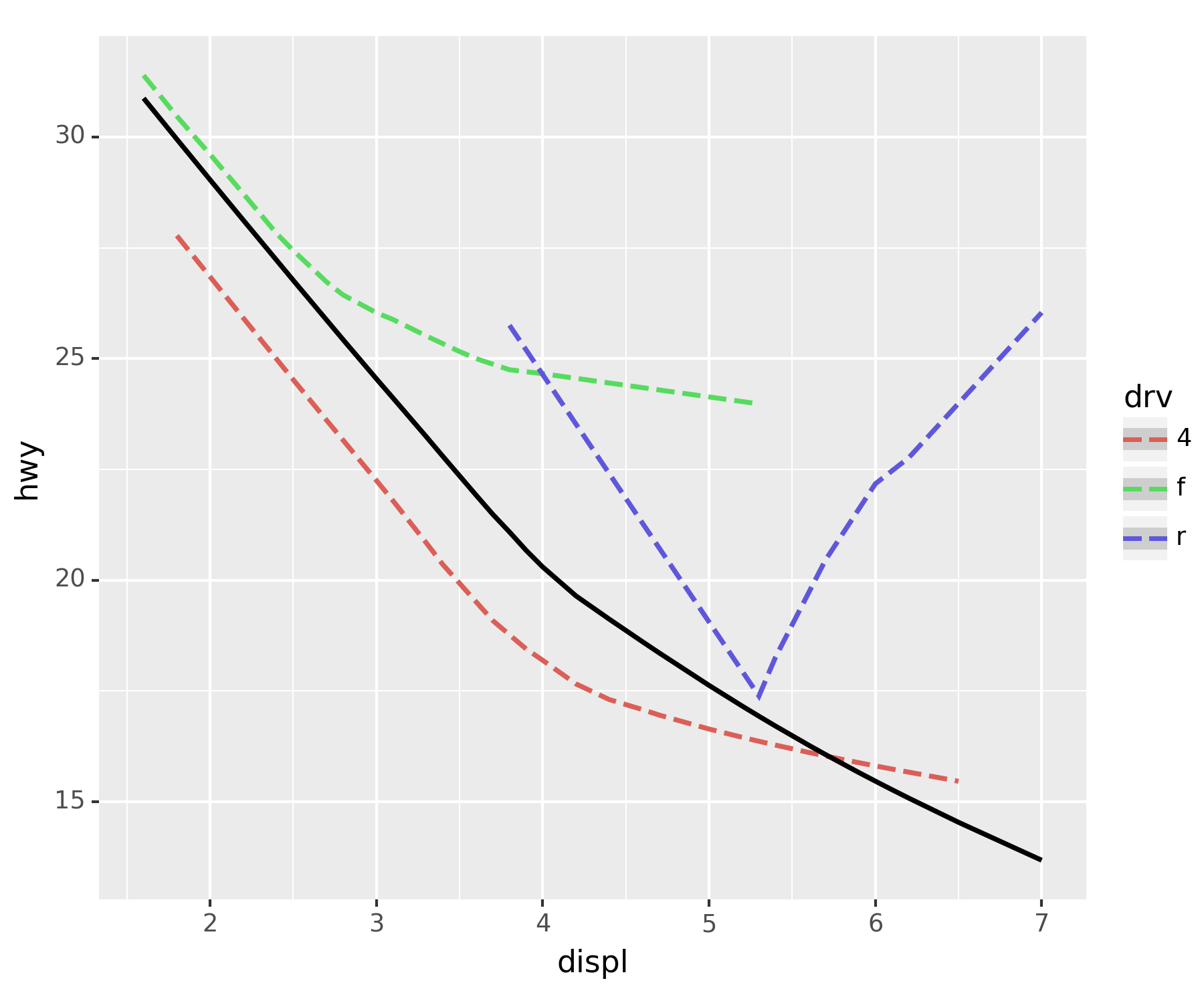
### C. 다양한 조합
fig + point + smoothC:\Users\hollyriver\anaconda3\envs\py\lib\site-packages\plotnine\stats\smoothers.py:330: PlotnineWarning: Confidence intervals are not yet implemented for lowess smoothings.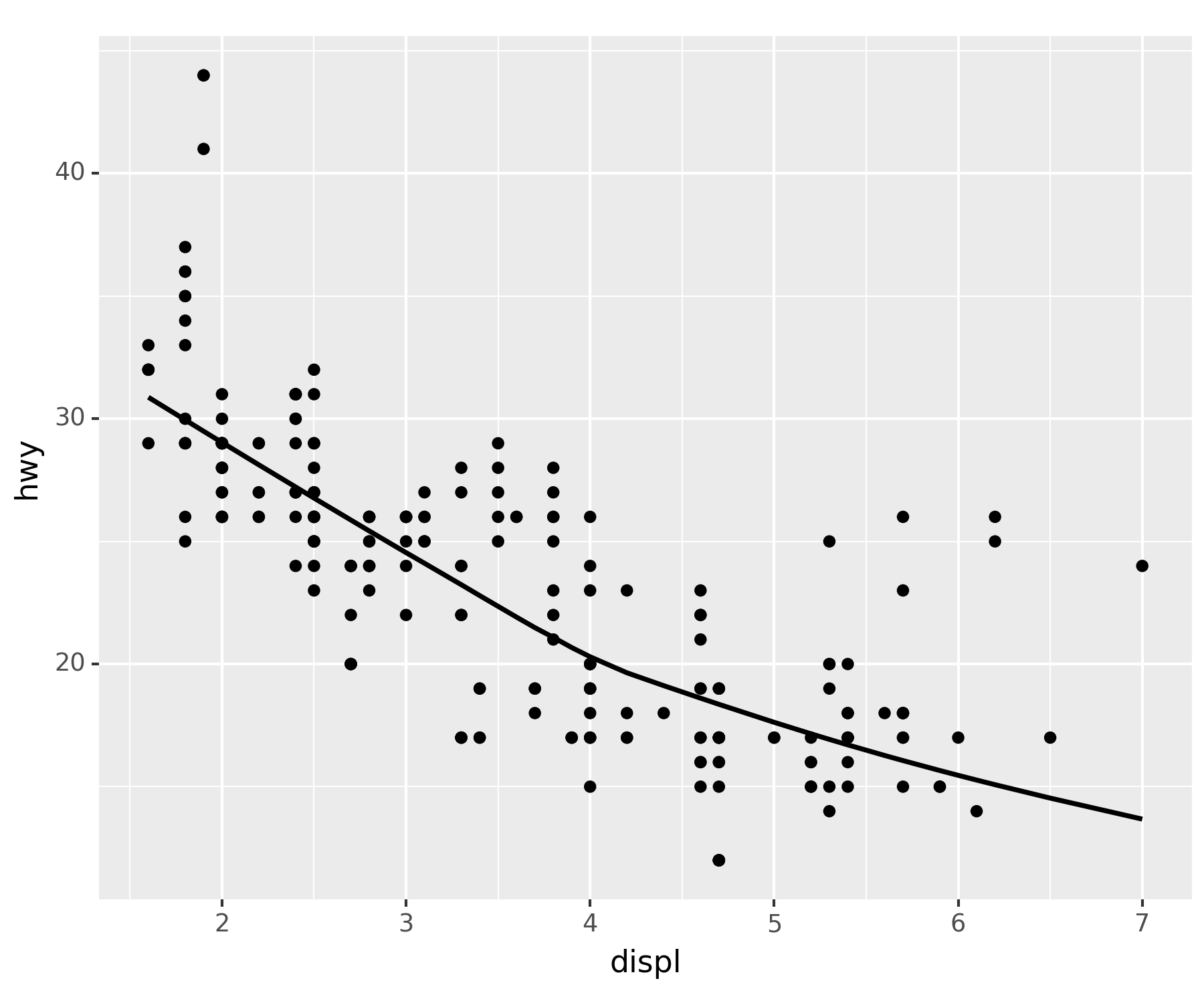
fig + smooth_better + point_betterC:\Users\hollyriver\anaconda3\envs\py\lib\site-packages\plotnine\stats\smoothers.py:330: PlotnineWarning: Confidence intervals are not yet implemented for lowess smoothings.
C:\Users\hollyriver\anaconda3\envs\py\lib\site-packages\plotnine\stats\smoothers.py:330: PlotnineWarning: Confidence intervals are not yet implemented for lowess smoothings.
C:\Users\hollyriver\anaconda3\envs\py\lib\site-packages\plotnine\stats\smoothers.py:330: PlotnineWarning: Confidence intervals are not yet implemented for lowess smoothings.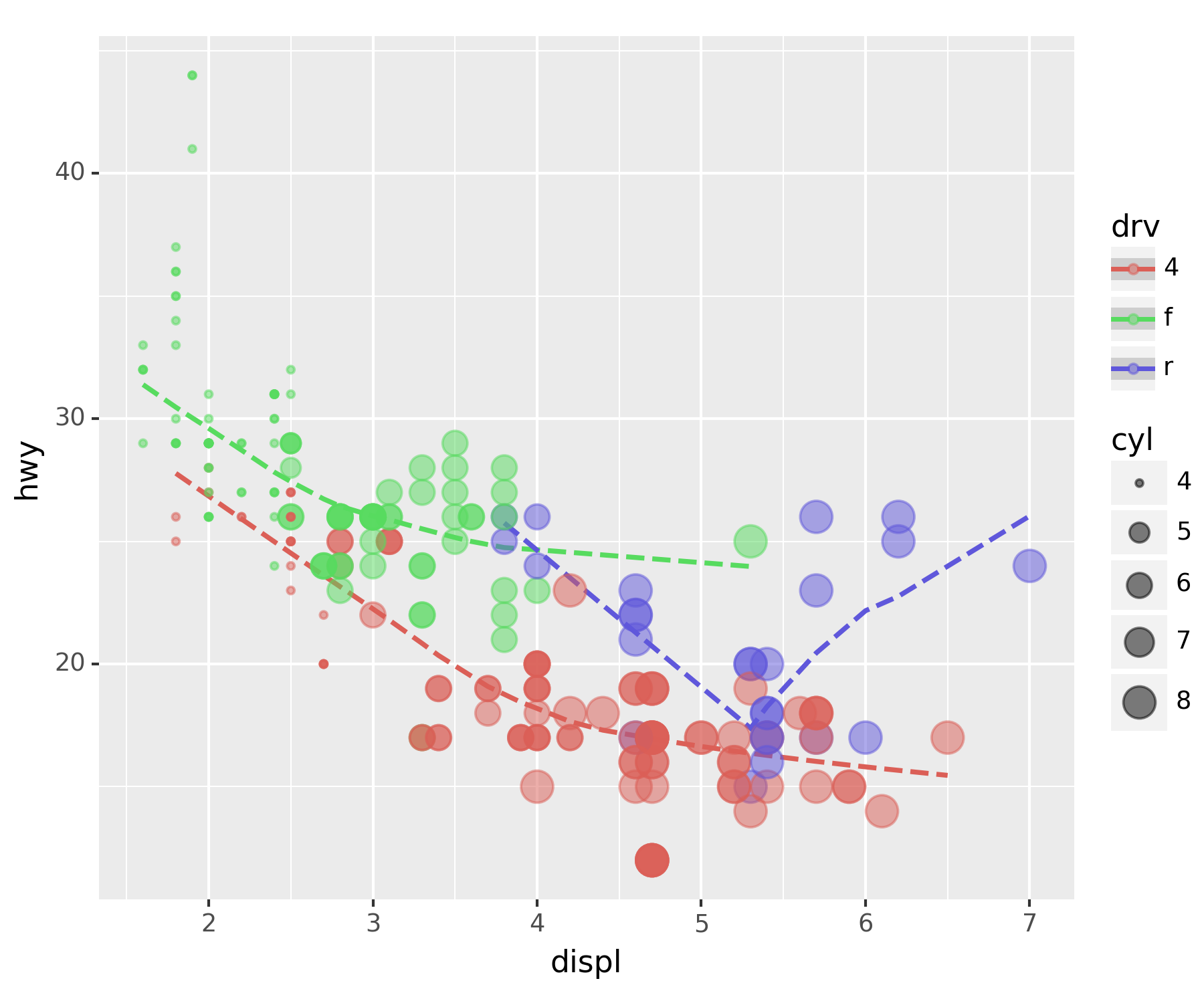
- 전체 추세선 추가
fig + smooth_better + point_better + geom_smooth(aes(x = 'displ', y = 'hwy'), color = 'white', linetype = 'dashed', size = 3)C:\Users\hollyriver\anaconda3\envs\py\lib\site-packages\plotnine\stats\smoothers.py:330: PlotnineWarning: Confidence intervals are not yet implemented for lowess smoothings.
C:\Users\hollyriver\anaconda3\envs\py\lib\site-packages\plotnine\stats\smoothers.py:330: PlotnineWarning: Confidence intervals are not yet implemented for lowess smoothings.
C:\Users\hollyriver\anaconda3\envs\py\lib\site-packages\plotnine\stats\smoothers.py:330: PlotnineWarning: Confidence intervals are not yet implemented for lowess smoothings.
C:\Users\hollyriver\anaconda3\envs\py\lib\site-packages\plotnine\stats\smoothers.py:330: PlotnineWarning: Confidence intervals are not yet implemented for lowess smoothings.
7. 아이스크림을 많이 먹으면 걸리는 병 - 인과관계와 상관관계
### A. 교회의 수와 범죄, 아이스크림과 소아마비
| 교회의 개수 | 범죄건수 | |
|---|---|---|
| 전주 | 100 | 20 |
| 부산 | 1000 | 200 |
| 서울 | 5000 | 1000 |
- 결론(?) : 교회가 많을 수록 범죄도 많아진다???
배경없이 숫자만 비교할 경우, 상관관계를 인과관계로 착각할 수도 있다.
인구에 대한 인과를 착각
- 내용요약
- 여름 → 수영장 → 소아마비
- 여름 → 아이스크림
- 아이스크림과 소아마비는 상관관계가 높다. 따라서 아이스크림 성분 중에서 소아마비를 유발하는 유해물질이 있을 것이다(?)
다른 변인을 통제하고(인구가 동일한 지역), 비교하려는 대상만 차이를 부여해야 한다.
### B. 기상자료
- 기상자료 다운로드
temp=pd.read_csv('https://raw.githubusercontent.com/guebin/DV2022/master/posts/temp.csv').iloc[:,3].to_numpy()
## 판다스 데이터의 4번째 열만 가져와 numpy.array로 만든다.plt.plot(temp) ## 이럴 때는 ggplot보다 matplotlib가 훨씬 편하다.
plt.show()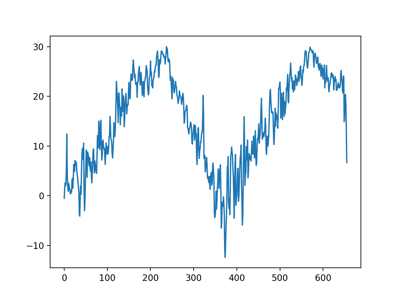
### C. 숨은 진짜 상황 1 : 온도 -> 아이스크림 판매량
-아래와 같은 관계를 가정하자. \[\text{아이스크림 판매량} = 20 + 2 \times \text{온도} + \text{오차}\]
np.random.seed(1) ## 결과가 같도록 시드 설정
icecream = 20 + 2 * temp + np.random.randn(len(temp))*10 ## N(0, 10^2)
plt.plot(temp, icecream, 'o', alpha = 0.5)
plt.show()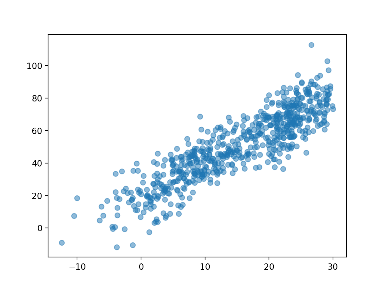
### D. 숨은 진짜 상황 2 : 온도 -> 소아마비 반응수치
- 아래와 같은 관계를 가정하자. \[\text{소아마비 반응수치} = 30 + 0.5 \times \text{온도} + \text{오차}\]
np.random.seed(2)
disease = 30 + 0.5 * temp + np.random.randn(len(temp))*1 ## N(0,1)
plt.plot(temp, disease, 'o', alpha = 0.5)
plt.show()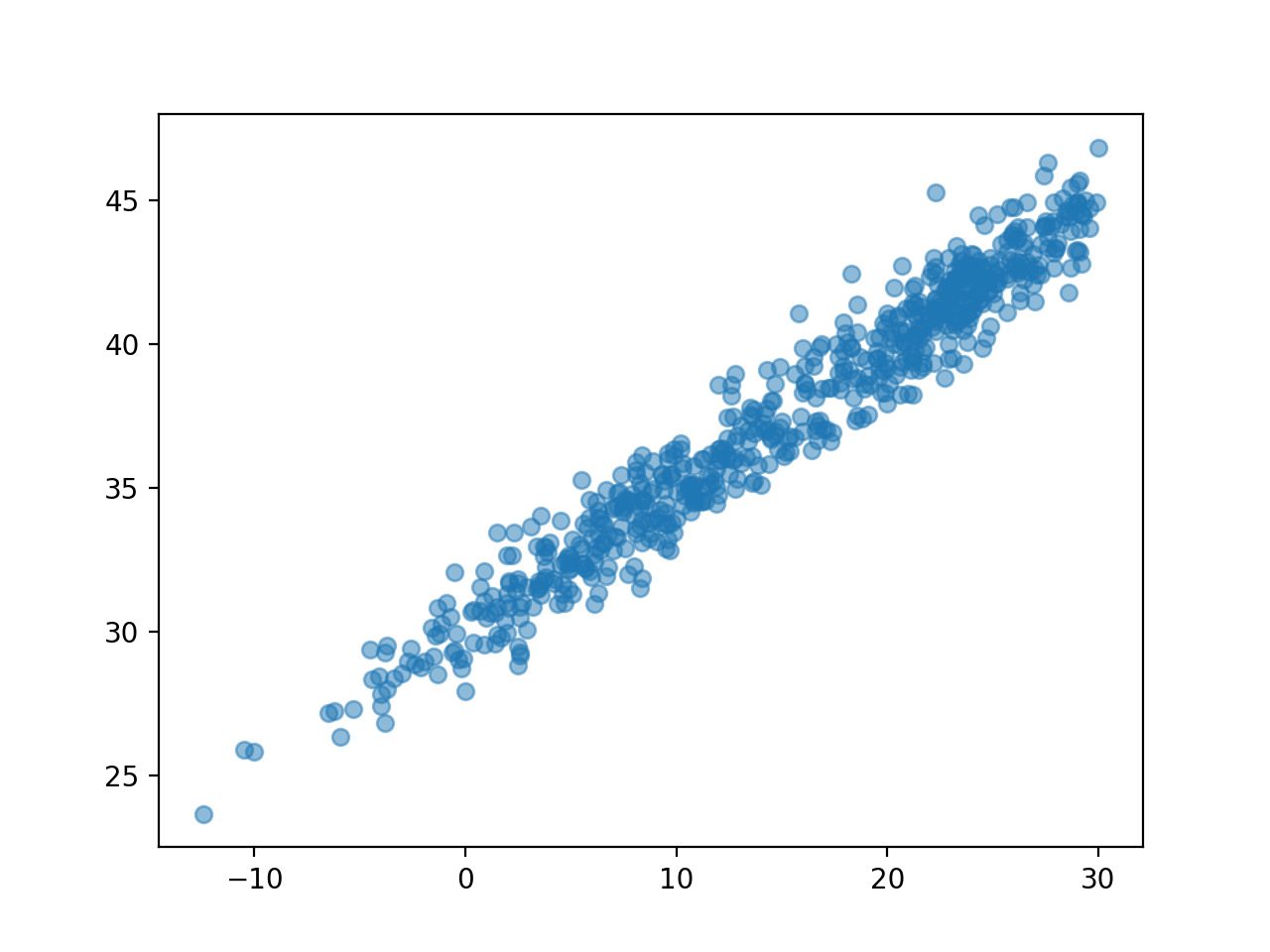
### E. 우리가 관측한 상황(온도는 은닉되어 있음)
plt.plot(icecream, disease, 'o', alpha=0.3)
plt.show()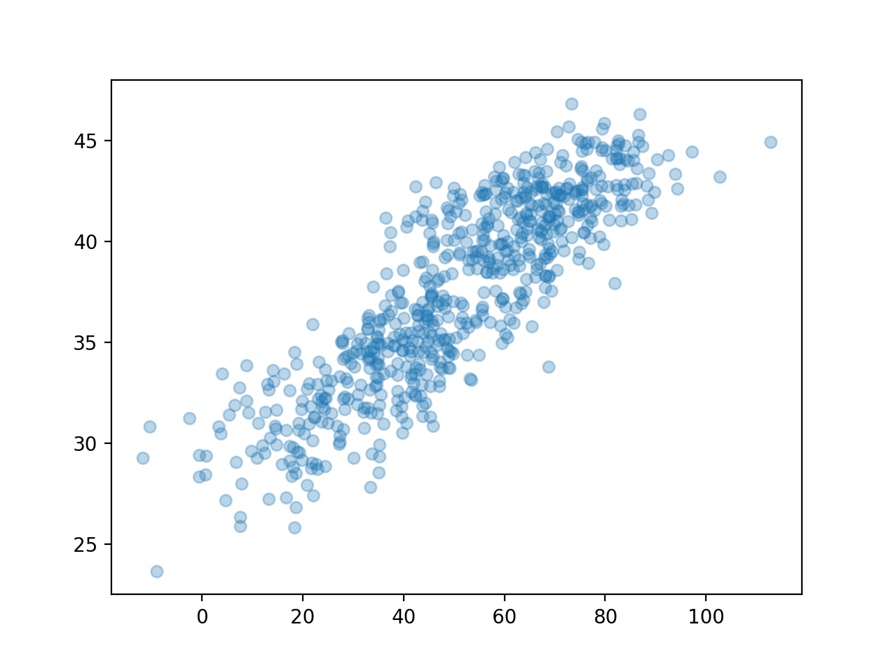
np.corrcoef(icecream,disease)array([[1. , 0.86298975],
[0.86298975, 1. ]])여름만 뽑아서 플랏한다면?
plt.plot(icecream,disease,'o',alpha=0.3)
plt.plot(icecream[temp>25], disease[temp>25],'o') ## 기온이 25도 이상, 즉, 여름(아마도)
plt.show()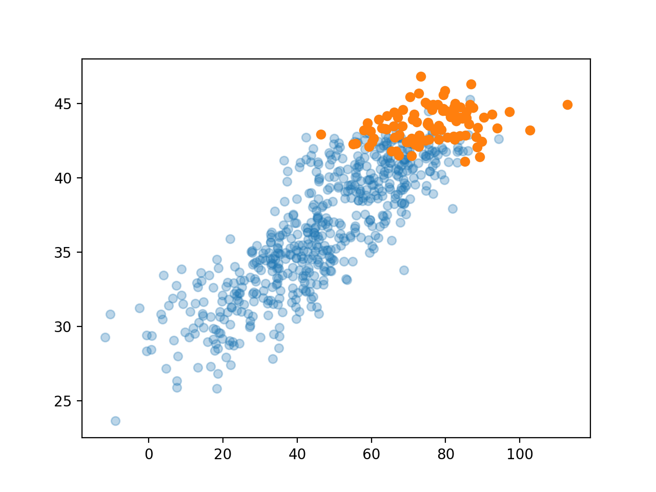
### F. ggplot으로 온도구간을 세분화하여 시각화하자.
- 데이터를 데이터프레임으로
df = pd.DataFrame({'temp' : temp, 'ice' : icecream, 'dis' : disease})
df| temp | ice | dis | |
|---|---|---|---|
| 0 | -0.5 | 35.243454 | 29.333242 |
| 1 | 1.4 | 16.682436 | 30.643733 |
| 2 | 2.6 | 19.918282 | 29.163804 |
| 3 | 2.0 | 13.270314 | 32.640271 |
| 4 | 2.5 | 33.654076 | 29.456564 |
| ... | ... | ... | ... |
| 651 | 19.9 | 68.839992 | 39.633906 |
| 652 | 20.4 | 76.554679 | 38.920443 |
| 653 | 18.3 | 68.666079 | 39.882650 |
| 654 | 12.8 | 42.771364 | 36.613159 |
| 655 | 6.7 | 30.736731 | 34.902513 |
656 rows × 3 columns
- 구간별로 나눈 변수를 추가 : pd.cut(df, bins = int)
df.assign(temp_cut = pd.cut(df.temp, bins = 5)) ## 온도를 4구간으로 분할한다| temp | ice | dis | temp_cut | |
|---|---|---|---|---|
| 0 | -0.5 | 35.243454 | 29.333242 | (-3.92, 4.56] |
| 1 | 1.4 | 16.682436 | 30.643733 | (-3.92, 4.56] |
| 2 | 2.6 | 19.918282 | 29.163804 | (-3.92, 4.56] |
| 3 | 2.0 | 13.270314 | 32.640271 | (-3.92, 4.56] |
| 4 | 2.5 | 33.654076 | 29.456564 | (-3.92, 4.56] |
| ... | ... | ... | ... | ... |
| 651 | 19.9 | 68.839992 | 39.633906 | (13.04, 21.52] |
| 652 | 20.4 | 76.554679 | 38.920443 | (13.04, 21.52] |
| 653 | 18.3 | 68.666079 | 39.882650 | (13.04, 21.52] |
| 654 | 12.8 | 42.771364 | 36.613159 | (4.56, 13.04] |
| 655 | 6.7 | 30.736731 | 34.902513 | (4.56, 13.04] |
656 rows × 4 columns
cut_df = df.assign(temp_cut = pd.cut(df.temp, bins = 7))
fig = ggplot(cut_df)
point = geom_point(aes(x = 'ice', y = 'dis', color = 'temp_cut'), alpha = 0.2)
smooth = geom_smooth(aes(x = 'ice', y = 'dis', color = 'temp_cut'), linetype = 'dashed')
fig + point + smoothC:\Users\hollyriver\anaconda3\envs\py\lib\site-packages\plotnine\stats\smoothers.py:330: PlotnineWarning: Confidence intervals are not yet implemented for lowess smoothings.
C:\Users\hollyriver\anaconda3\envs\py\lib\site-packages\plotnine\stats\smoothers.py:330: PlotnineWarning: Confidence intervals are not yet implemented for lowess smoothings.
C:\Users\hollyriver\anaconda3\envs\py\lib\site-packages\plotnine\stats\smoothers.py:330: PlotnineWarning: Confidence intervals are not yet implemented for lowess smoothings.
C:\Users\hollyriver\anaconda3\envs\py\lib\site-packages\plotnine\stats\smoothers.py:330: PlotnineWarning: Confidence intervals are not yet implemented for lowess smoothings.
C:\Users\hollyriver\anaconda3\envs\py\lib\site-packages\plotnine\stats\smoothers.py:330: PlotnineWarning: Confidence intervals are not yet implemented for lowess smoothings.
C:\Users\hollyriver\anaconda3\envs\py\lib\site-packages\plotnine\stats\smoothers.py:330: PlotnineWarning: Confidence intervals are not yet implemented for lowess smoothings.
C:\Users\hollyriver\anaconda3\envs\py\lib\site-packages\plotnine\stats\smoothers.py:330: PlotnineWarning: Confidence intervals are not yet implemented for lowess smoothings.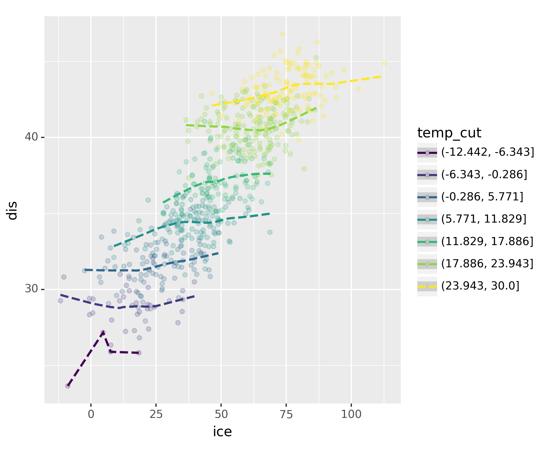
실제로 보니 상관관계가 없어보인다.
진짜 아이스크림을 먹고 배탈이 났다면?
np.random.seed(1)
icecream_sales = 30 + 2 * temp + np.random.randn(len(temp))*10np.random.seed(2)
disease = 30 + 0 * temp + 0.15 * icecream + np.random.randn(len(temp))*1 ## temp, 온도가 미치는 영향을 제로로df2 = pd.DataFrame({'temp' : temp, 'ice' : icecream_sales, 'dis' : disease})
df2.assign(temp_cut = pd.cut(df2.temp, bins = 7))| temp | ice | dis | temp_cut | |
|---|---|---|---|---|
| 0 | -0.5 | 45.243454 | 34.869760 | (-6.343, -0.286] |
| 1 | 1.4 | 26.682436 | 32.446099 | (-0.286, 5.771] |
| 2 | 2.6 | 29.918282 | 30.851546 | (-0.286, 5.771] |
| 3 | 2.0 | 23.270314 | 33.630818 | (-0.286, 5.771] |
| 4 | 2.5 | 43.654076 | 33.254676 | (-0.286, 5.771] |
| ... | ... | ... | ... | ... |
| 651 | 19.9 | 78.839992 | 40.009905 | (17.886, 23.943] |
| 652 | 20.4 | 86.554679 | 40.203645 | (17.886, 23.943] |
| 653 | 18.3 | 78.666079 | 41.032562 | (17.886, 23.943] |
| 654 | 12.8 | 52.771364 | 36.628863 | (11.829, 17.886] |
| 655 | 6.7 | 40.736731 | 36.163023 | (5.771, 11.829] |
656 rows × 4 columns
fig = ggplot(df2.assign(temp_cut = pd.cut(df2.temp,bins=7)))
point = geom_point(aes(x='ice',y='dis',color='temp_cut'),alpha=0.2)
smooth = geom_smooth(aes(x='ice',y='dis',color='temp_cut'),linetype='dashed')
fig + point + smoothC:\Users\hollyriver\anaconda3\envs\py\lib\site-packages\plotnine\stats\smoothers.py:330: PlotnineWarning: Confidence intervals are not yet implemented for lowess smoothings.
C:\Users\hollyriver\anaconda3\envs\py\lib\site-packages\plotnine\stats\smoothers.py:330: PlotnineWarning: Confidence intervals are not yet implemented for lowess smoothings.
C:\Users\hollyriver\anaconda3\envs\py\lib\site-packages\plotnine\stats\smoothers.py:330: PlotnineWarning: Confidence intervals are not yet implemented for lowess smoothings.
C:\Users\hollyriver\anaconda3\envs\py\lib\site-packages\plotnine\stats\smoothers.py:330: PlotnineWarning: Confidence intervals are not yet implemented for lowess smoothings.
C:\Users\hollyriver\anaconda3\envs\py\lib\site-packages\plotnine\stats\smoothers.py:330: PlotnineWarning: Confidence intervals are not yet implemented for lowess smoothings.
C:\Users\hollyriver\anaconda3\envs\py\lib\site-packages\plotnine\stats\smoothers.py:330: PlotnineWarning: Confidence intervals are not yet implemented for lowess smoothings.
C:\Users\hollyriver\anaconda3\envs\py\lib\site-packages\plotnine\stats\smoothers.py:330: PlotnineWarning: Confidence intervals are not yet implemented for lowess smoothings.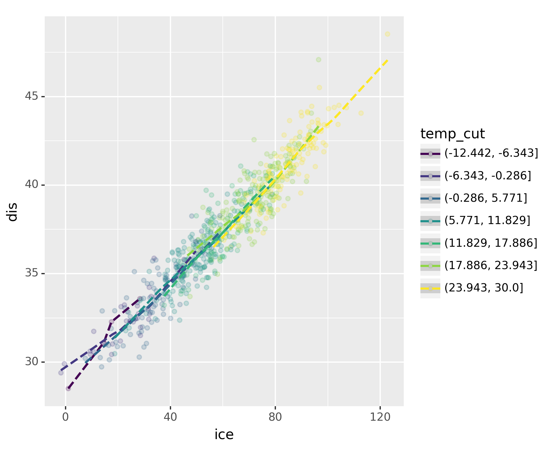
무친 인과관계
8. 결론
아이스크림 먹어도 소아마비 안걸려!
- 온도라는 흑막(은닉변수)을 잘 찾았고, 결과적으로 온도 -> 아이스크림 판매량 & 소아마비라는 합리적인 진리를 얻을 수 있었다.
고려할 흑막이 온도뿐이라는 보장이 있나?
이론적으로는 모든 은닉변수들을 통제하였을 경우에도 corr(X,Y)의 절댓값이 1에 가깝다면 그때는 인과성이 있음이라고 주장할 수 있다.(이 경우에도 둘 중 어느것이 원인인지 파악하는 것은 불가)
즉, 모든 은닉변수를 제거하면 상관성 = 인과성이다.
모든 흑막을 제거하는 건 사실상 불가능하지 않나?
실험계획을 잘 하면 흑막을 제거한 효과가 있음(무작위 추출 등)
인과추론 : 실험계획이 사실상 불가능한 경우가 있음 -> 모인 데이터에서 최대한 흑막2ㆍ3ㆍ4ㆍㆍㆍ등이 비슷한 그룹끼리 “매칭”을 시킨 뒤, 그룹간 corr을 구하여 규명한다!
데이터의 수가 방대해지면서 가능해졌다.